


Introduction:
Flexbox is a layout structure, which should be used to lay out HTML elements instead of using positions and float.
It will work under a container (parent), and the items (child) in the container are affected by the Flex property.
There are the main axis and cross axis like rows and columns in a normal layout structure.

Main axis: ROW
Cross axis: COLUMN
There are a few things more like main start, main end, cross start, and cross end as shown in the above image.
Flex properties:
These are the properties of PARENT
Flex(container):
The container is nothing but a class given to the parent which holds the elements we are required to flex.
The elements in a parent (container) denote as flex-items.
Display:
The display is the syntax to execute the flexbox property, without a display property it is unable to use any flex property in CSS
This defines a flex container; inline or block depending on the given value. It enables a flex context for all its direct children, the default flex is in row format (inline).
.container {
  display: flex; /* or inline-flex */
}
Note that CSS columns do not affect a flex container.
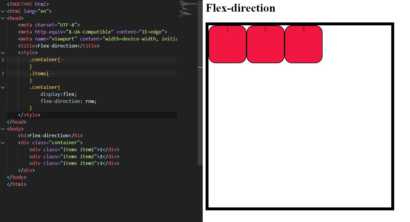
Flex-direction:
The flow of the document from the start to the end of a document's main axis and cross axis depends upon flex direction. it allows the items to flow either horizontally or vertically (rows and columns) in a container.
We can assign some properties to change the flow of flex.
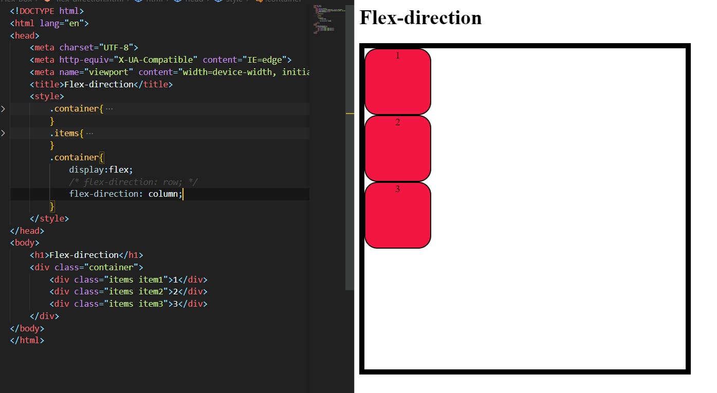
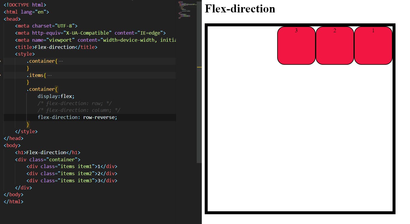
row(default): left to right inltr; right to left inrtlrow-reverse: right to left inltr; left to right inrtlcolumn: same asrowbut top to bottomcolumn-reverse: same asrow-reversebut bottom to top

Row:
The flex itself comes in a row if we apply flex-direction:row; it will not change because it is already a row in default.
Column:
The column value changes the flex-direction from its main axis to the cross axis, nothing but (row to column).
syntax: flex-direction:column;
Row-reverse:
It reverses the order of the flow from RTL to LTR in the main axis.
syntax: flex-direction:row-reverse;
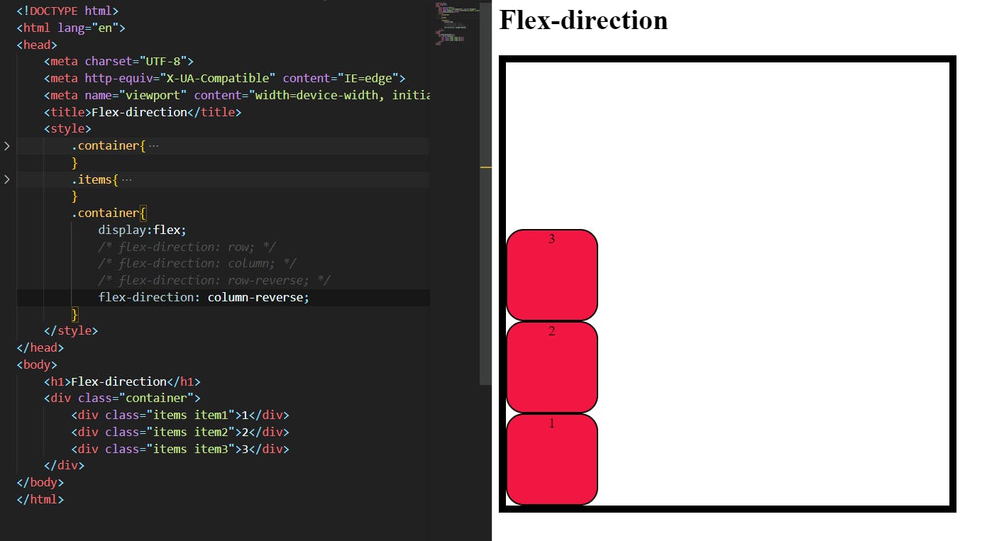
Column-reverse:
it reverses the flow order from (top to bottom) to (bottom to top) in the cross axis.
syntax: flex-direction:column-reverse;
Justify-content:
This property will allow you to align the items in the container on the main axis. It increases the flexibility of the items in the container. but have reached their maximum size. It also exerts some control over the alignment of items when they overflow the line.
These are some values of Justify-content
.container {
  justify-content: flex-start | flex-end | center | space-between | space-around | space-evenly | start | end | left | right ... + safe | unsafe;
}
Flex-start :
The flex-start value allows you to draw items in a flex container to the start of the main axis.
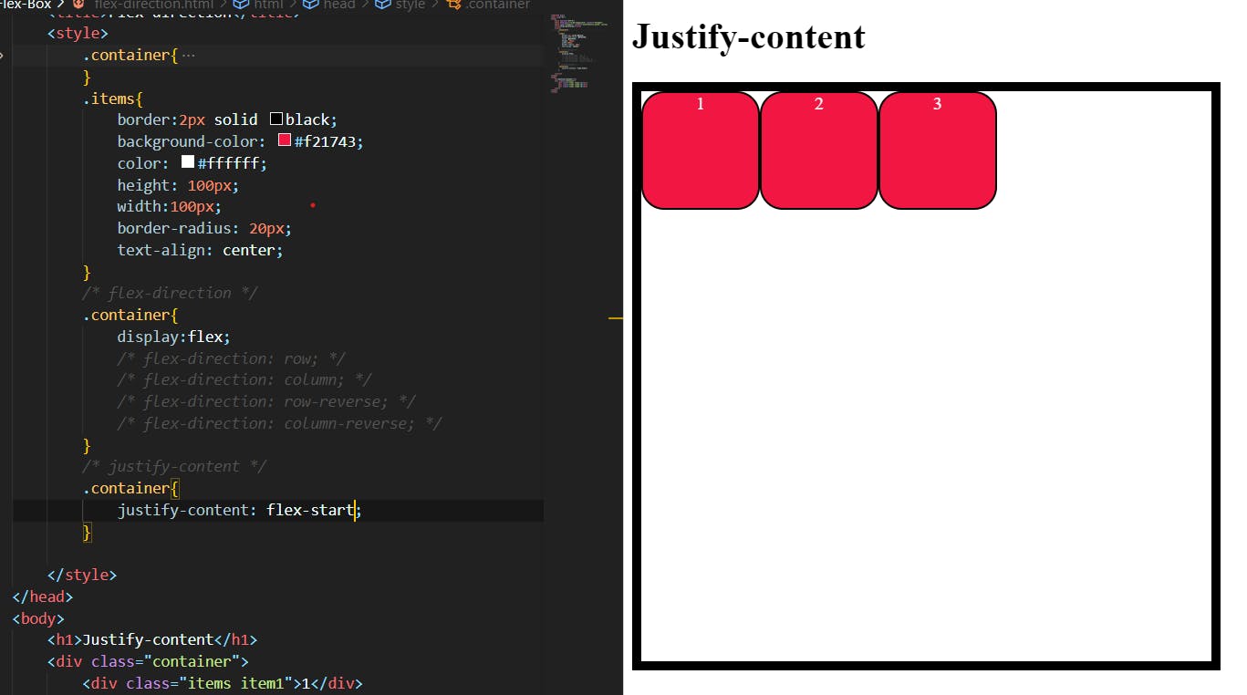
The default flex property is from the start of the container. so there is no difference to see.
As you see the values start , left are also the same as Flex-start.
Flex-end :
This value will allow you to draw the items in a container at the end of the main axis.
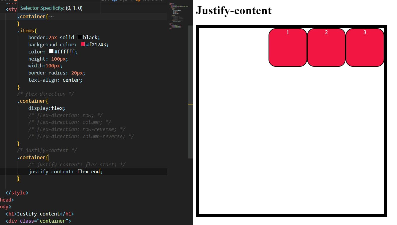
The value end , right is also the same as flex-end .
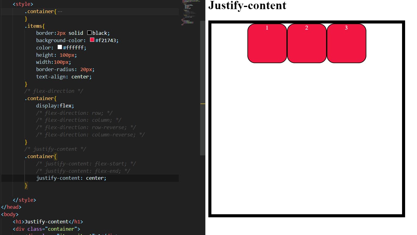
Center:
It will align the items in a container at the center of the main axis.
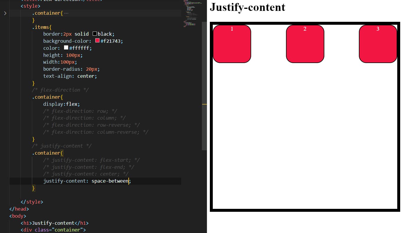
space-between:
In this property, the items will distribute evenly by the spacing between the items, not the start and end.
Space-around:
items are evenly distributed in the line with equal space around them. Note that visually the spaces aren’t equal, since all the items have equal space on both sides. The first item will have one unit of space against the container edge, but two units of space between the next item because that next item has its own spacing that applies.
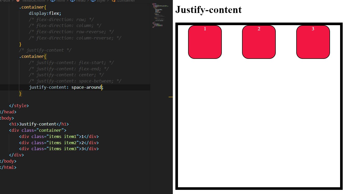
As you see. at the start and end of the container item gap is one unit but the space between the two items was different. that means each item has a space around it of one unit so that when the middle of the two items are spaced according to it
Space-evenly:
This will allow you to align items evenly from start to end in the main axis. the value is the same in between items also.
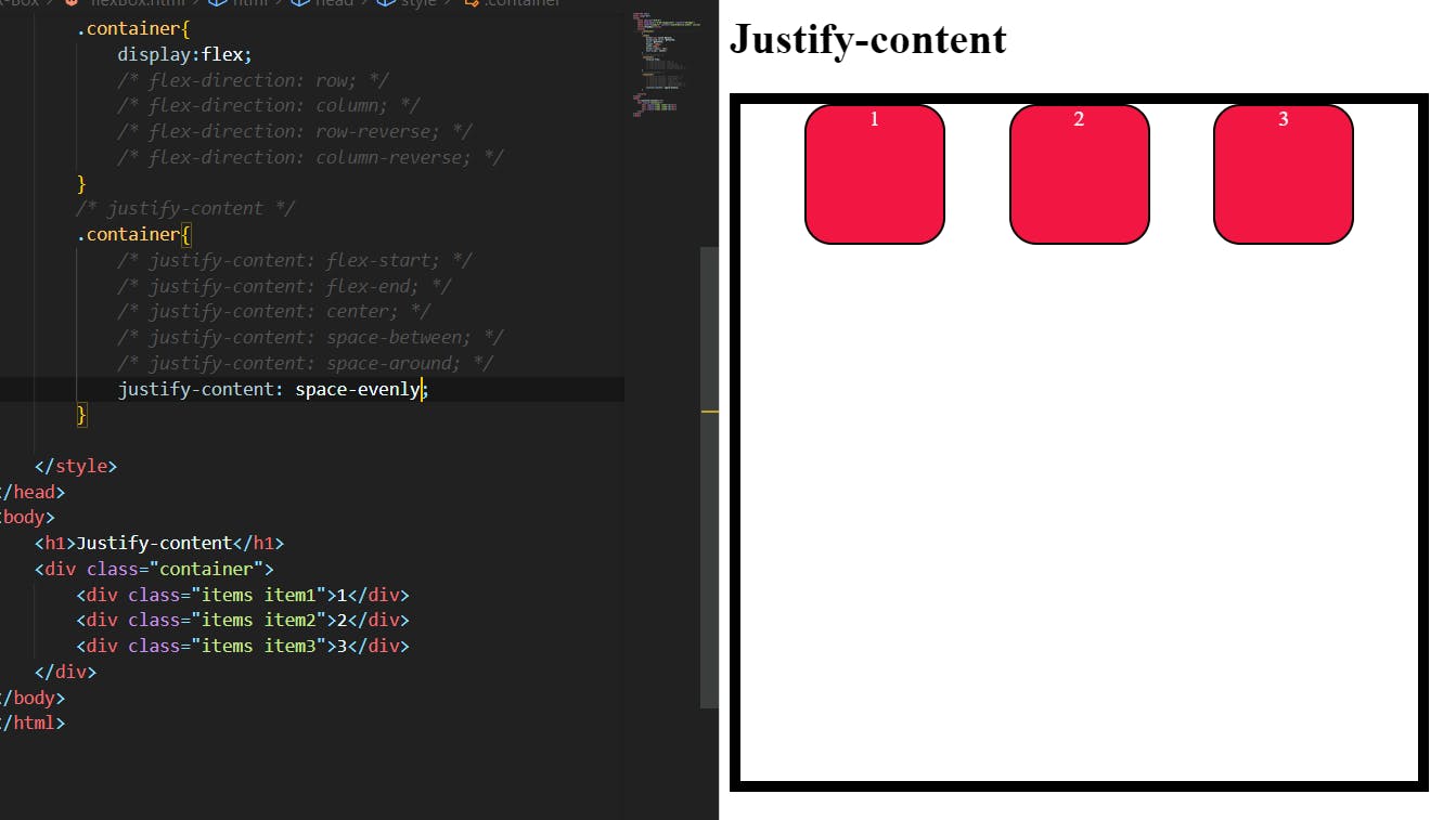
The items are evenly distributed in the flex container.
Align-items:
This defines the default behavior for how flex items are laid out along the cross-axis on the current line. Think of it as the justify-content version for the cross-axis (perpendicular to the main axis).
.container {
  align-items: stretch | flex-start | flex-end | center | baseline | first baseline | last baseline | start | end | self-start | self-end + ... safe | unsafe;
}
Stretch:
it is nothing but default it stretches to fill the container (still respecting min-width/max-width).
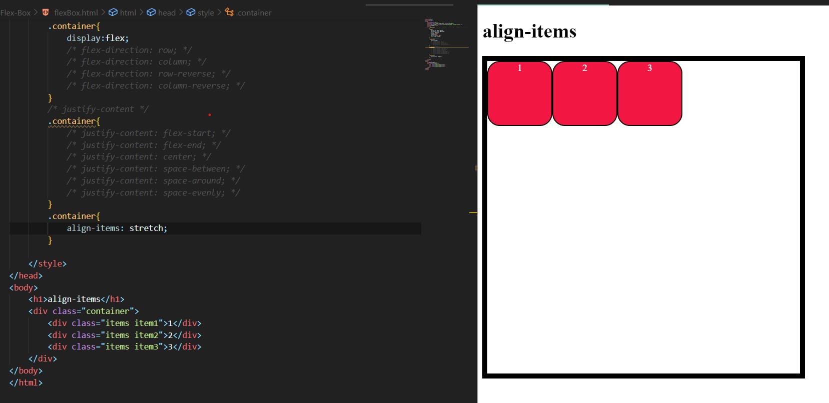
as you see nothing will happen.
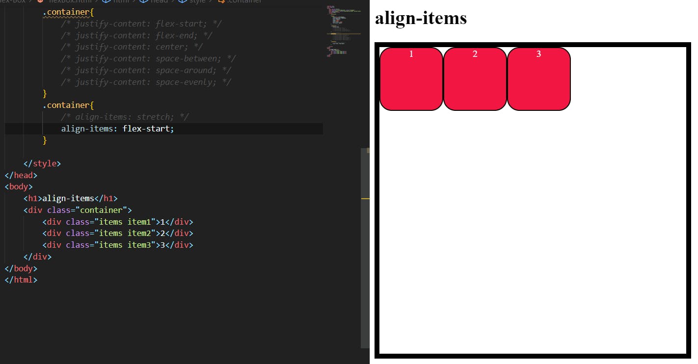
Flex-start:
It allows pushing all items in a flex container to the start of the cross-axis.
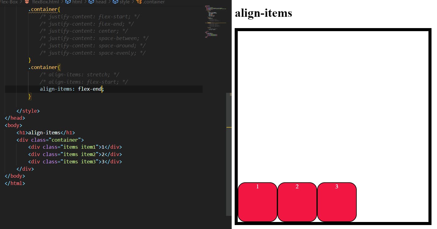
Flex-end:
It pushes the flex items in a flex container to its end in a cross-axis.
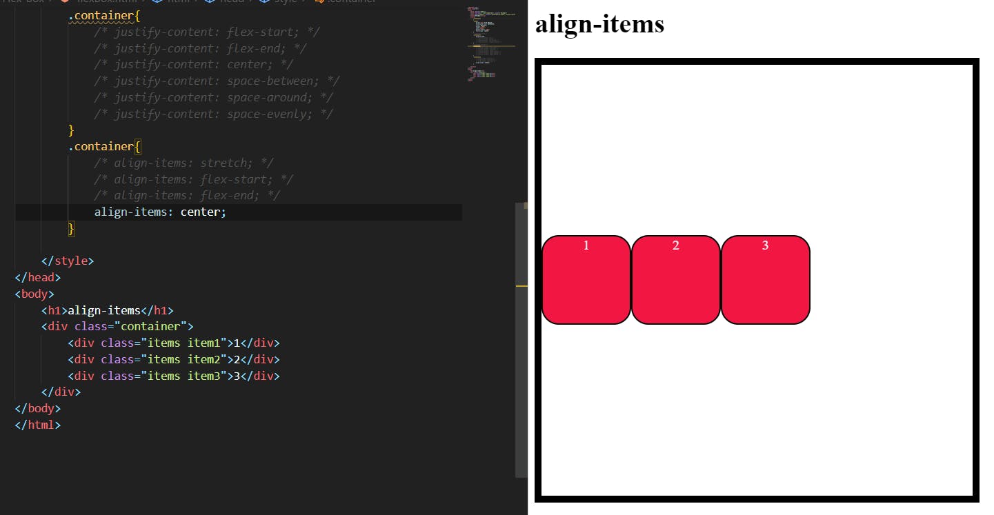
Center:
It pushes all the items in the flex container to the center of the cross-axis.
Baseline:
items are aligned such as their baselines align.
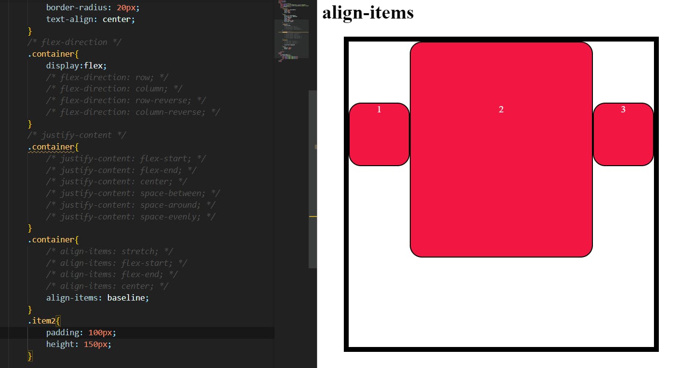
as you see that the baseline of the content is aligned when the item size is different from each other.
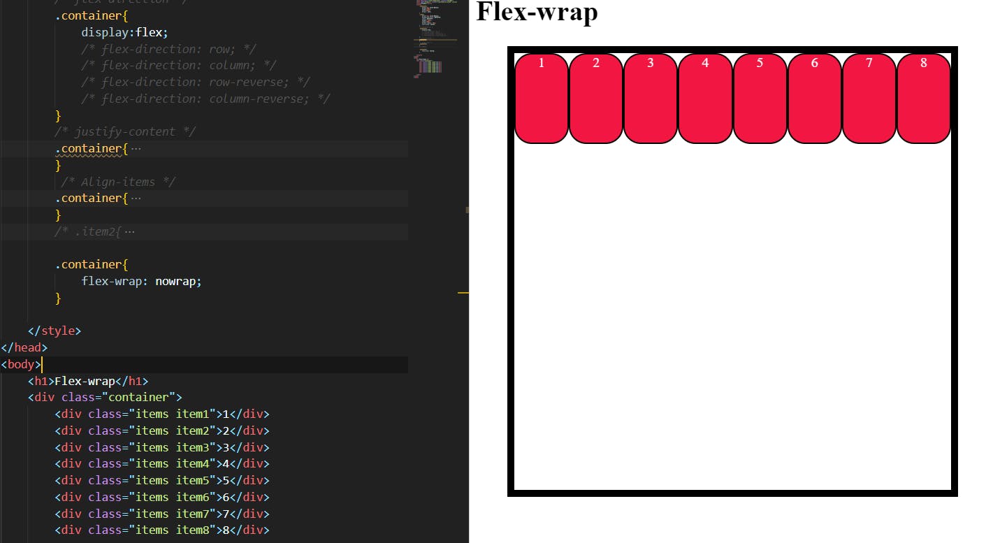
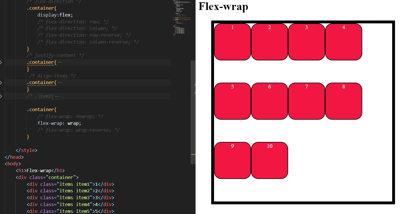
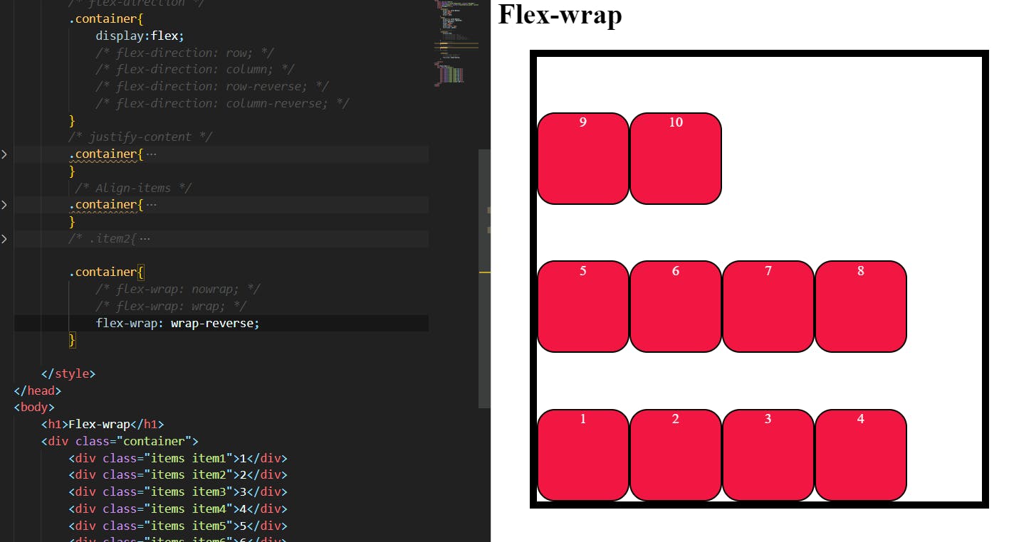
Flex-wrap:
When we apply flex to a container. the items will fit in one line at the main axis default. if there are more items that do not fit in one line, the items will be lost their shape and fit into one location, by using Flex-wrap the property we can wrap the items.
.container {
  flex-wrap: nowrap | wrap | wrap-reverse;
}
Nowrap:
It is a default value it will change nothing in the flex container.
Wrap:
it Wraps up the items available in the flex containers in multiple lines top to bottom.
Wrap-reverse:
it Wraps up the items available in the flex containers in multiple lines from bottom to top.
Flex-flow:
This is a shorthand for the flex-direction and flex-wrap properties, which together define the flex container’s main and cross axes. The default value is row nowrap.
.container {
  flex-flow: column wrap;
}
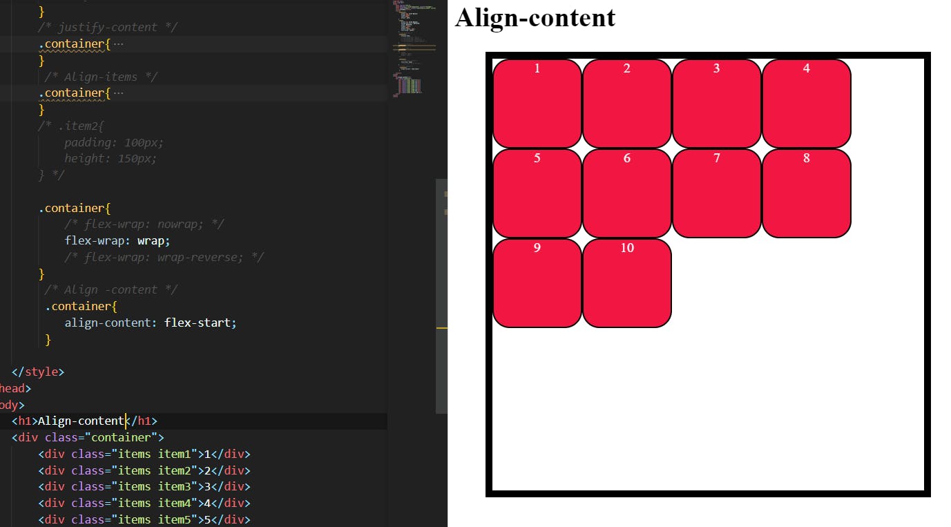
Align-content:
This aligns a flex container’s lines within when there is extra space in the cross-axis, similar to how justify-content aligns individual items within the main axis.
It is used only when flex-wrap values set to wrap or wrap-reverse the align-content property will work to align the lines
.container {
  align-content: flex-start | flex-end | center | space-between | space-around | space-evenly | stretch | start | end | baseline | first baseline | last baseline + ... safe | unsafe;
}
Flex-start with wrap:
This property is the same as the Justify-content Flex-start but it works only when the wrap or wrap-reverse is active.
Flex-end with wrap-reverse:
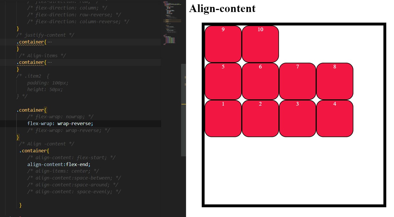
As you see I used Flex-end in the top image the items should be at the end of the cross -axis but we applied the wrap-reverse .
the flex-end the property changed into flex-start reverse items.
Gap/Row-gap/column-gap:
The gap property will control the space between two items. It doesn't apply to the start and end of the container.
Gap:
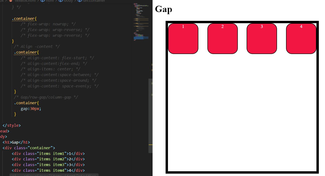
As you see it won't affect the start and end of the container, only it is applied between the items.
Row-Gap:
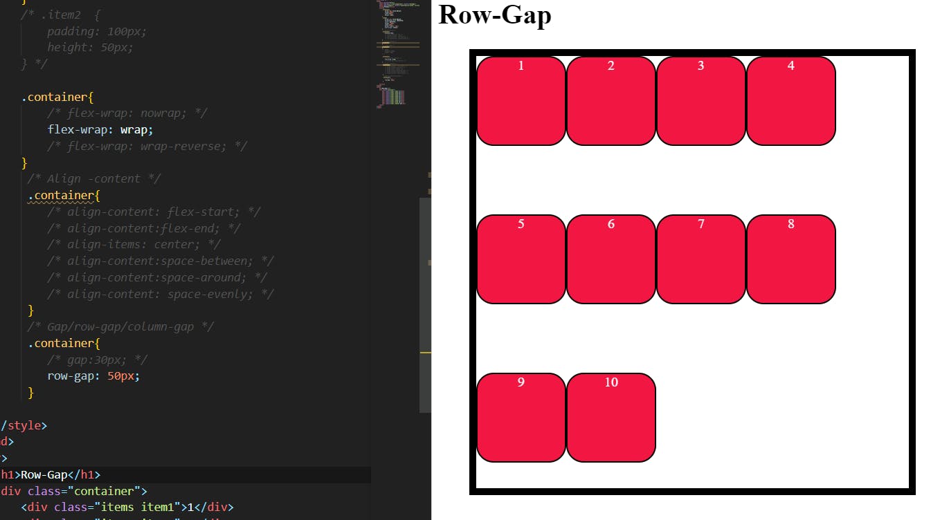
It applied the spaces only between the rows of the container. play around with values you will find some small space in between two items also.
Column-gap:
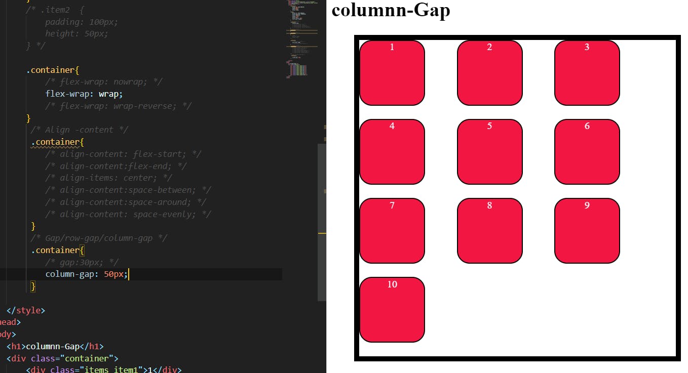
It applied the spaces only between the Columns of the container. as you can see that the gap was created automatically between rows due to the lack of items in the container. if we increase the value of row-gap .
Flex(items):
These are the properties of the child.
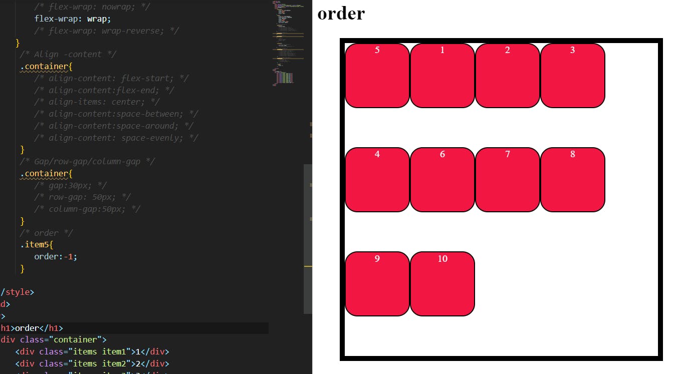
Order:
By default, the items in the flex container are in order but this order the property we can change the order of each item.
The order property controls the order in which flex items appear within the flex container, by assigning them to ordinal groups. It takes a single <integer> value, which specifies which ordinal group the flex item belongs to.
Flex-grow:
This defines the ability for a flex item to grow if necessary. It accepts a unitless value that serves as a proportion. It dictates what amount of the available space inside the flex container the item should take up.
If all items have flex-grow set to 1, the remaining space in the container will be distributed equally to all children. If one of the children has a value of 2, that child would take up twice as much of the space as either one of the others (or it will try, at least).
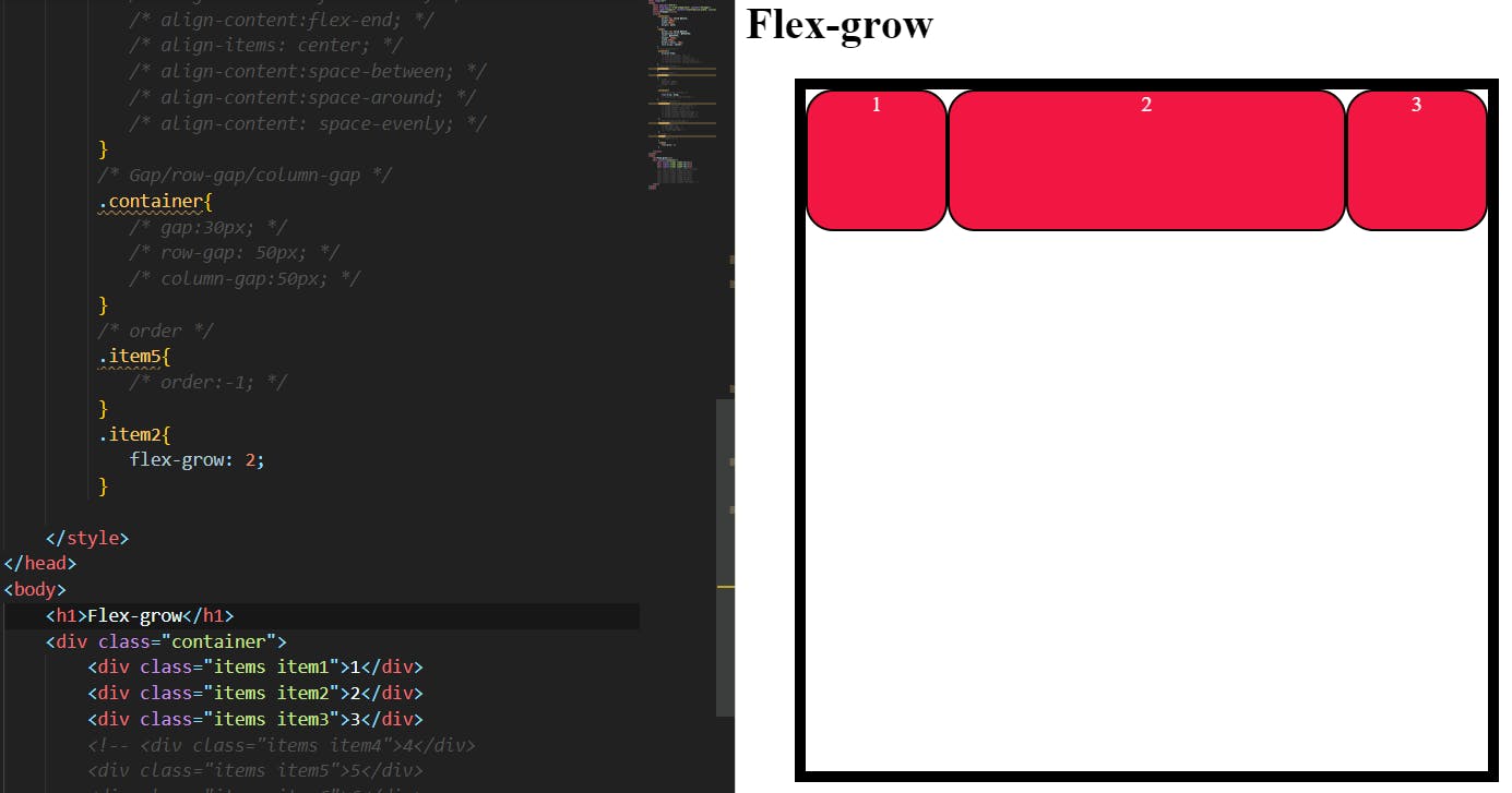
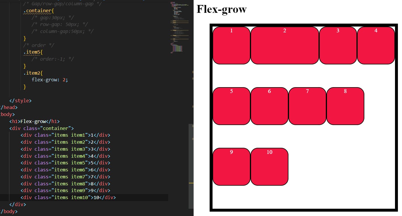
As you see in these two images up there when we apply Flex-grow to item2 it grows according to the space left in the container when the items are fewer.
If you apply that when the items are more the item2 consumes less space compared to the fewer items.
Flex-shrink:
This defines the ability for a flex item to shrink if necessary.
.item {
  flex-shrink: 3; /* default 1 */
}
Negative numbers are invalid.
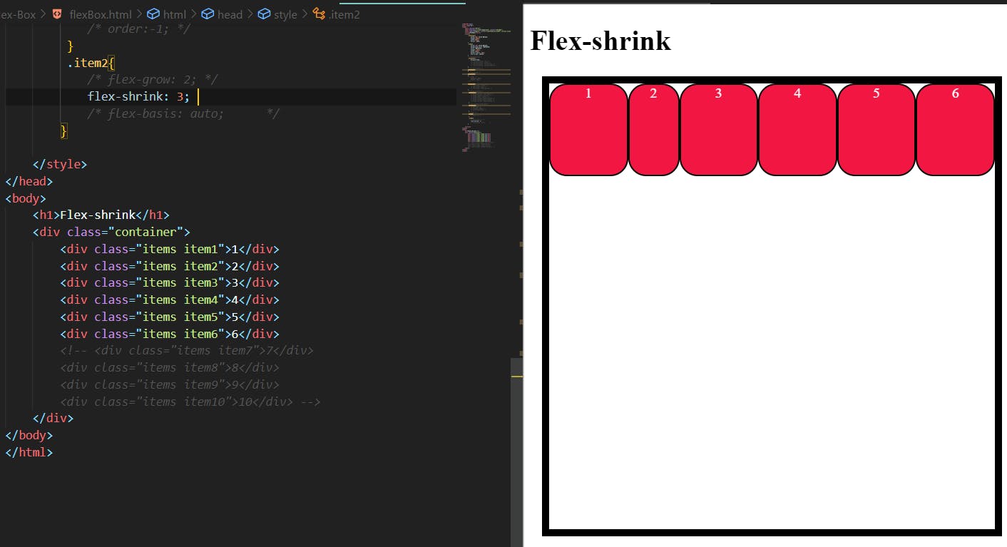
In the above image, the item2 shrink when the items are more than the container's space is less. it doesn't shrink while the space is more.
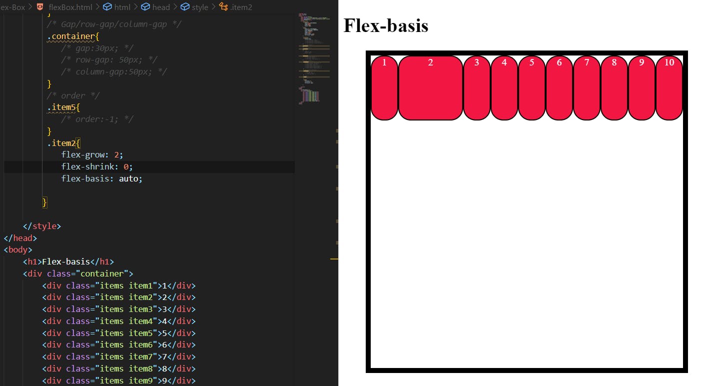
Flex-basis:
This defines the default size of an element before the remaining space is distributed. It can be a length (e.g. 20%, 5rem, etc.) or a keyword. The auto keyword means “look at my width or height property” (which was temporarily done by the main-size keyword until deprecated). The content keyword means “size it based on the item’s content” – this keyword isn’t well supported yet, so it’s hard to test and harder to know what its brethren max-content, min-content, and fit-content do.
.item {
  flex-basis:  | auto; /* default auto */
}
If set to 0, the extra space around content isn’t factored in. If set to, the extra space is distributed based on its flex-grow value.
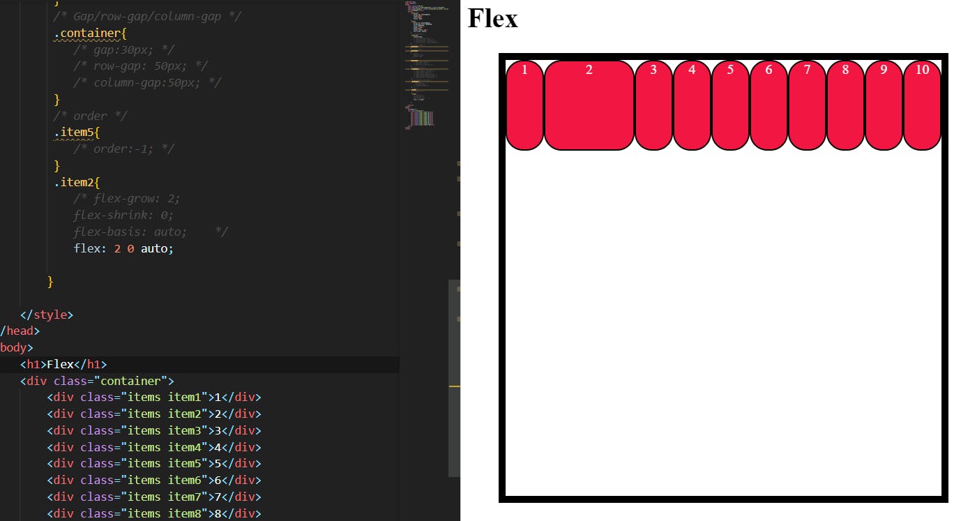
Flex:
This is the shorthand for flex-grow, flex-shrink and flex-basis combined. The second and third parameters (flex-shrink and flex-basis) are optional. The default is 0 1 auto, but if you set it with a single number value, like flex: 5;, that changes the flex-basis to 0%, so it’s like setting flex-grow: 5; flex-shrink: 1; flex-basis: 0%;.
.item {
  flex: none | [ <'flex-grow'> <'flex-shrink'>? || <'flex-basis'> ]
}
It is recommended that you use this shorthand property rather than set the individual properties. The shorthand sets the other values intelligently.
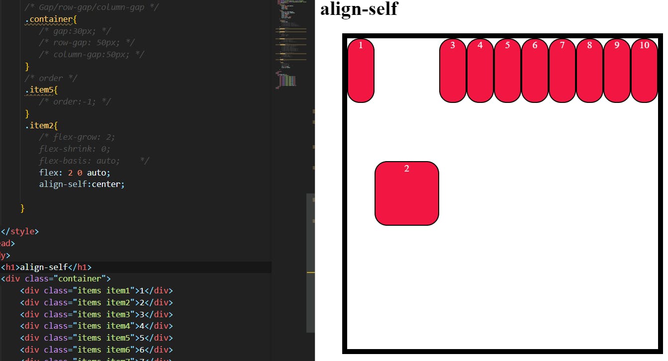
Align-self:
This allows the default alignment (or the one specified by align-items) to be overridden for individual flex items.
Please see the align-items explanation to understand the available values.
.item {
  align-self: auto | flex-start | flex-end | center | baseline | stretch;
}
Note that float, clear and vertical-align have no effect on a flex item.