


Table of contents
Intro
CSS GRID is a two-dimensional grid-based layout .in the past, we used tables, float, positions, and inline-block. All of these methods were essentially hacks and left out a lot of necessary functionality (vertical centering, for instance). Flexbox is a great layout. but its one-directional flow has different use cases — and they actually work together quite well! Grid is the very first CSS module created specifically to solve the layout problems we’ve all been hacking our way around for as long as we’ve been making websites.
Basics
Before diving into the concepts of Grid it’s important to understand the terminology. Since the terms involved here are all kinda conceptually similar, it’s easy to confuse them with one another if you don’t first memorize their meanings defined by the Grid specification. But don’t worry, there aren’t many of them.
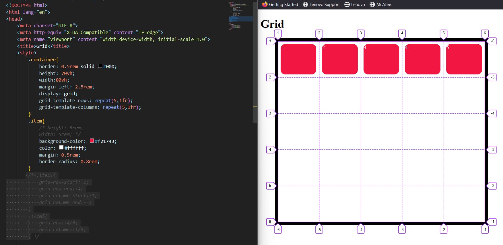
Grid Container
The element on which display: grid is applied. It’s the direct parent of all the grid items. In this example container is the grid container.
Grid Line
The dividing lines make up the structure of the grid. They can be either vertical (“column grid lines”) or horizontal (“row grid lines”) and reside on either side of a row or column. Here the yellow line is an example of a column grid line.
Grid Track
The space between two adjacent grid lines. You can think of them as the columns or rows of the grid. Here’s the grid track between the second and third-row grid lines.
Grid Area
The total space is surrounded by four grid lines. A grid area may be composed of any number of grid cells. Here’s the grid area between row grid lines 1 and 3, and column grid lines 1 and 3.
Grid Item
The children (i.e. direct descendants) of the grid container. Here the item elements are grid items but sub-item aren’t.
Grid Cell
The space between two adjacent rows and two adjacent column grid lines. It’s a single “unit” of the grid. Here are the grid cell between row grid lines 1 and 2, and column grid lines 2 and 3.
CSS GRID properties:
Display:
while we going to use the Grid layout we have to use the display property to enable the Grid
grid– generates a block-level gridinline-grid– generates an inline-level grid
.container {
  display: grid | inline-grid;
}
grid-template-columns,grid-template-rows:
It defines the combination of rows and columns with a separate list of values. The values represent the track size, and the space between them represents the grid line.
It will be added to the container class so the grid layout will properly function.
here are some ways to write the syntax
 grid-template-columns: repeat(4,200px);
 grid-template-columns: 100px 100px auto 200px;
 grid-template-columns: repeat(3,1fr);
.container {
  grid-template-rows: [row1-start] 25% [row1-end row2-start] 25% [row2-end];
}
If your definition contains repeating parts, you can use the repeat() notation to streamline things:
.container {
  grid-template-columns: repeat(3, 20px [col-start]);
}
Which is equivalent to this:
.container {
  grid-template-columns: 20px [col-start] 20px [col-start] 20px [col-start];
}
If multiple lines share the same name, they can be referenced by their line name and count.
.item {
  grid-column-start: col-start 2;
}
The fr unit allows you to set the size of a track as a fraction of the free space of the grid container. For example, this will set each item to one third the width of the grid container:
.container {
  grid-template-columns: 1fr 1fr 1fr;
}
The free space is calculated after any non-flexible items. In this example the total amount of free space available to the fr units doesn’t include the 50px:
.container {
  grid-template-columns: 1fr 50px 1fr 1fr;
}
As you can see that I wrote a syntax of grid-template-rows: repeat(5,1fr), and the same goes for columns . fr the unit allows you to set the size of a track as a fraction of the free space of the grid container. so the items in the grid container has equally distributed.
Grid template areas:
Defines a grid template by referencing the names of the grid areas which are specified with the grid-area property. Repeating the name of a grid area causes the content to span those cells. A period signifies an empty cell. The syntax itself provides a visualization of the structure of the grid.
Values:
<grid-area-name>– the name of a grid area specified withgrid-area.– a period signifies an empty grid cellnone– no grid areas are definedExample:
  .item-a {
    grid-area: header;
  }
  .item-b {
    grid-area: main;
  }
  .item-c {
    grid-area: sidebar;
  }
  .item-d {
    grid-area: footer;
  }

  .container {
    display: grid;
    grid-template-columns: 50px 50px 50px 50px;
    grid-template-rows: auto;
    grid-template-areas:
      "header header header header"
      "main main . sidebar"
      "footer footer footer footer";
  }
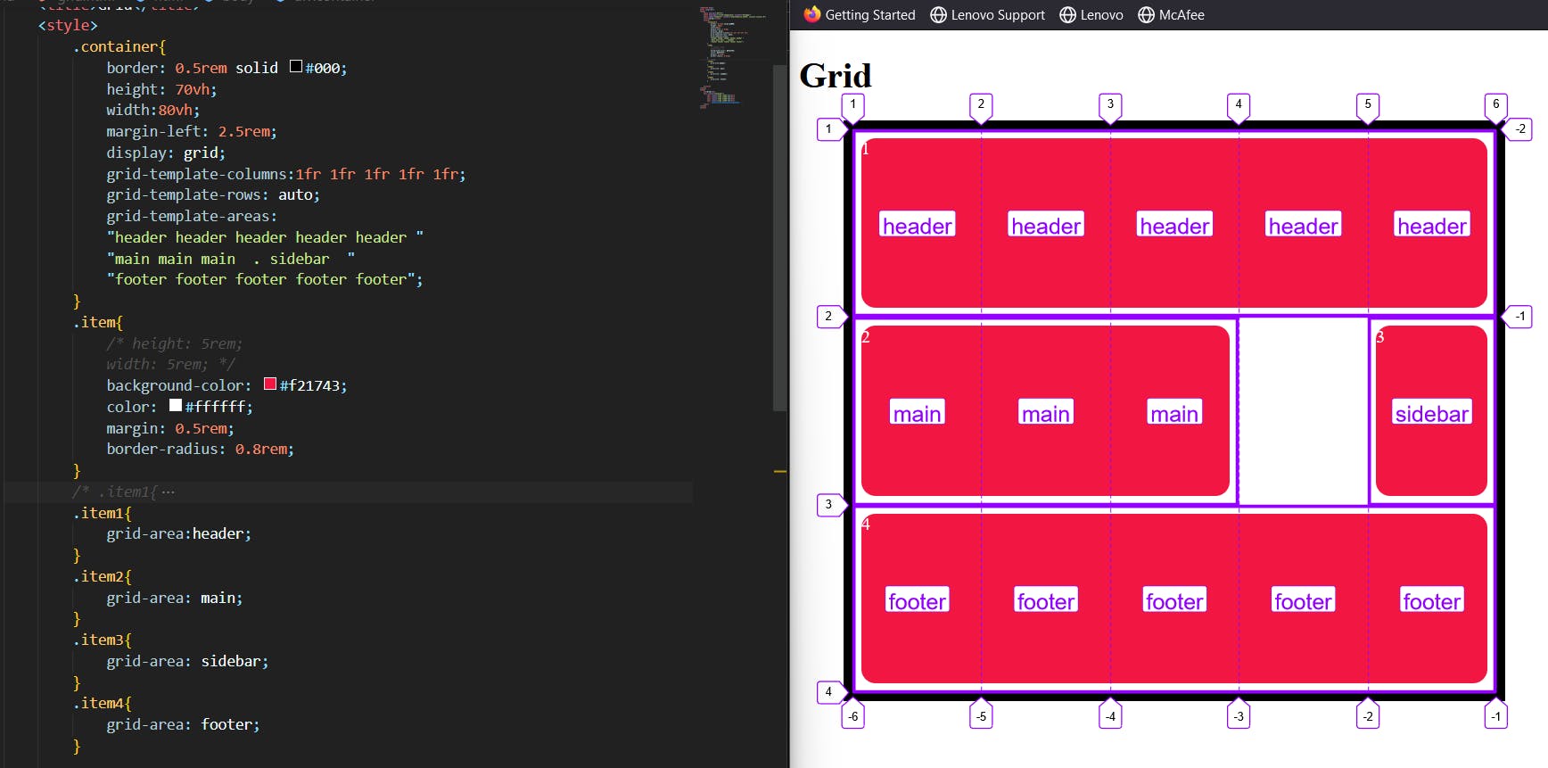
I selected the items and gave grid-area names to the header, main, sidebar, and footer. then I added the grid-template-areas property to the container and gave those values shown in the above image,
Each item is distributed according to the given values and it shows the name of the area that we mentioned at the grid-template-areas property, but one thing I want to tell you is that while you giving the values make sure you calculate the grid areas to avoid errors.
3. Grid template:
Grid-template Shorthand for setting grid-template-rows, and grid-template-columns in a single declaration.
.container {
  grid-template:
    25px 25px [rows] / auto 50px auto [columns];
}
.container {
  grid-template-rows: 25px 25px ;
  grid-template-columns: auto 50px auto;

}
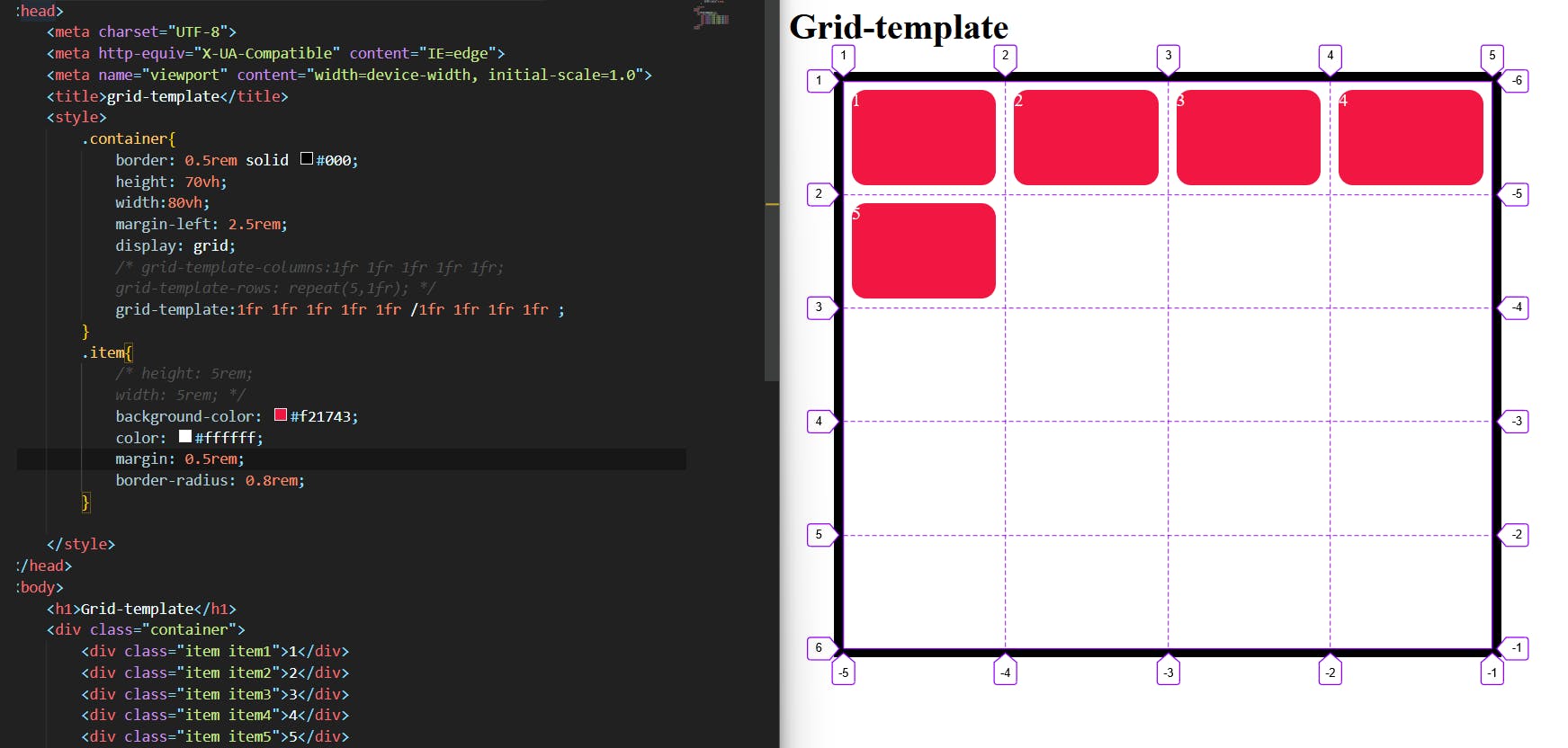
As we notice that we already know the grid-template-row and grid-template-column properties but the grid-template is the combination of both those properties so we separate these values by putting / grid-template-rows / grid-template-columns.
Gap:
A shorthand for column-gap row-gap grid-column-gap grid-row-gap.It is used to provide a gap between rows and columns in a grid.
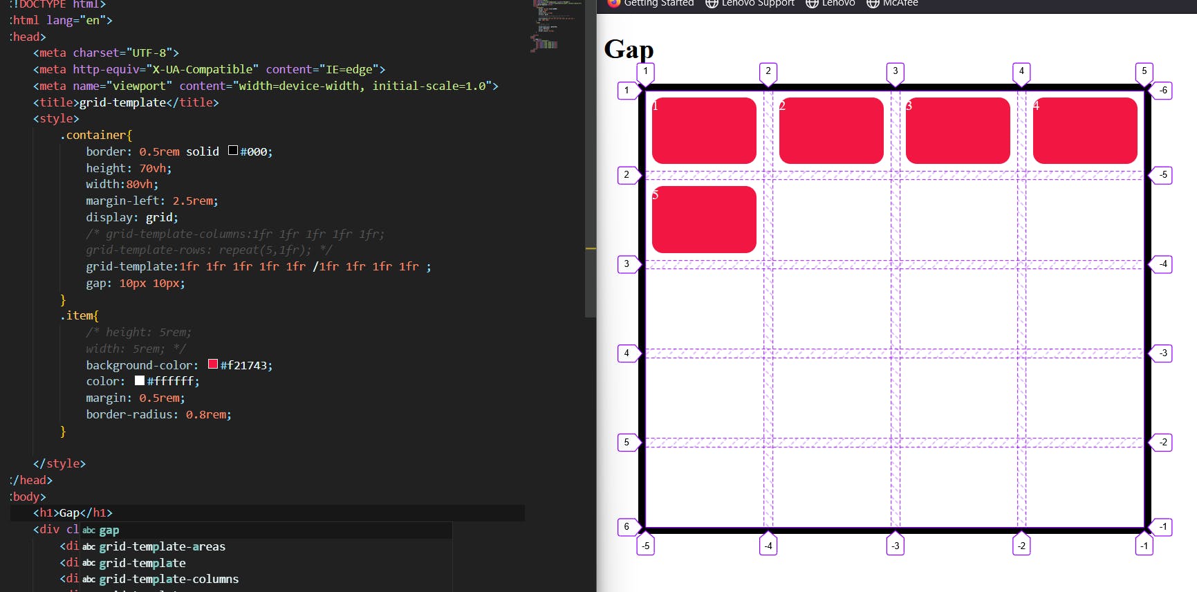
We can see that the gap between each item was created by creating space between the grid lines.
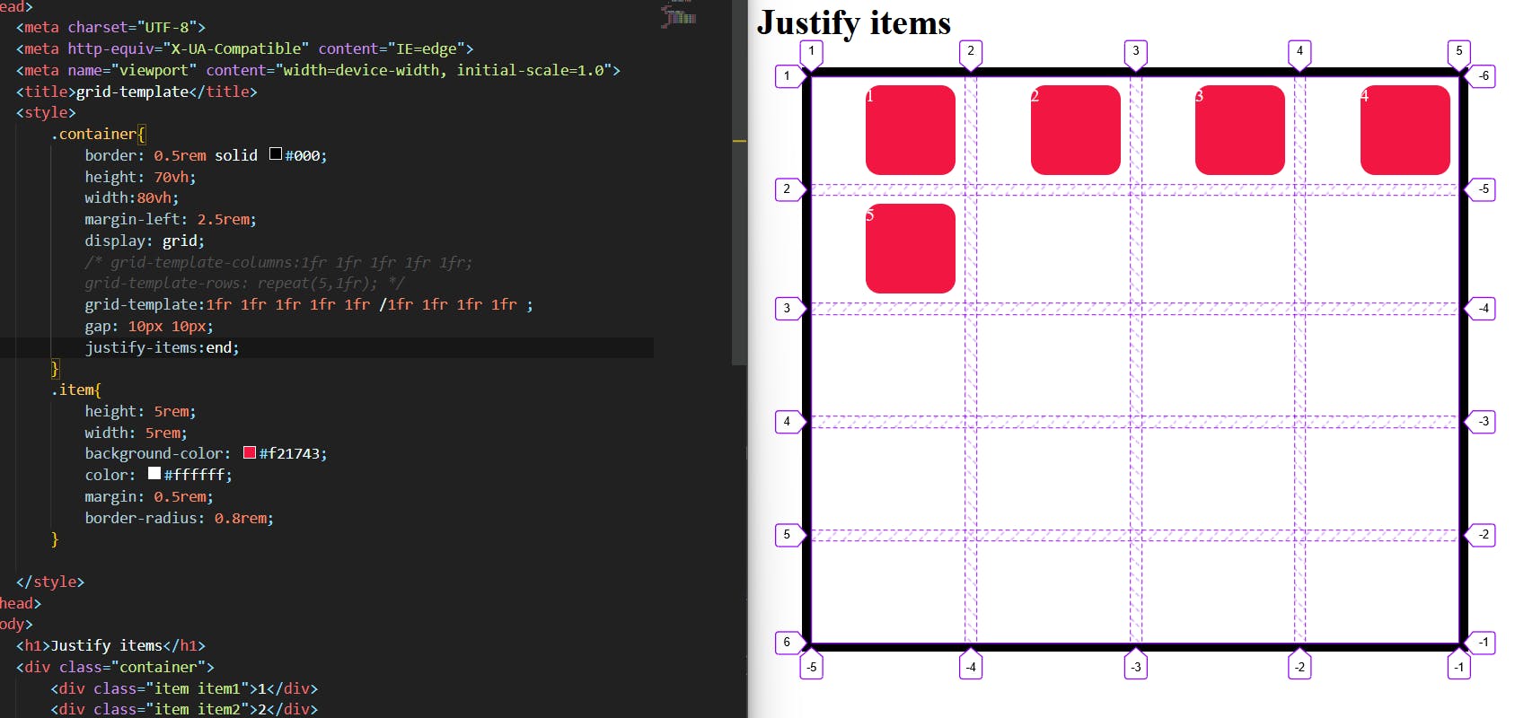
justify-items/justify-content:
We already familiar with the justify-content in flex-box
the Justify-items aligns grid items along rows and justify-content aligns all the grids to align themselves along rows.
COPY
.container {
  justify-items: start | end | center | stretch;
 justify-content: start | end | center | stretch | space-around | space-between | space-evenly;
}
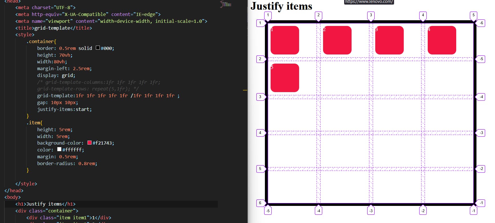
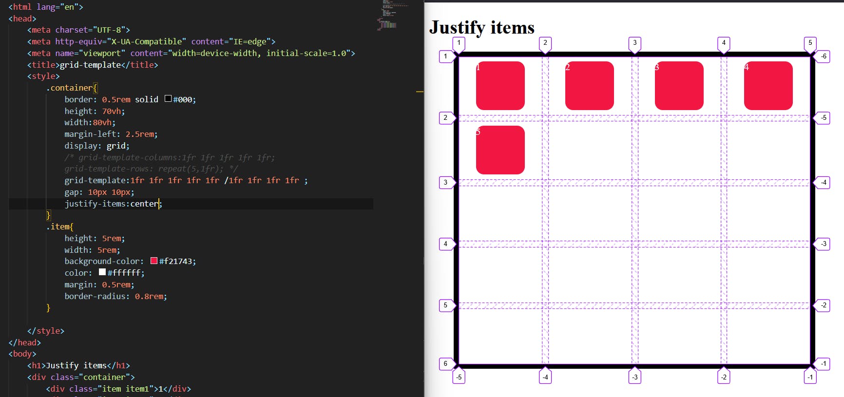
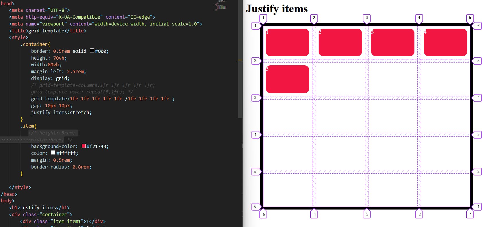
Justify-items:
justify-items examples:
justify-items: start;
justify-items: end;

justify-items:center;
justify-items: stretch;
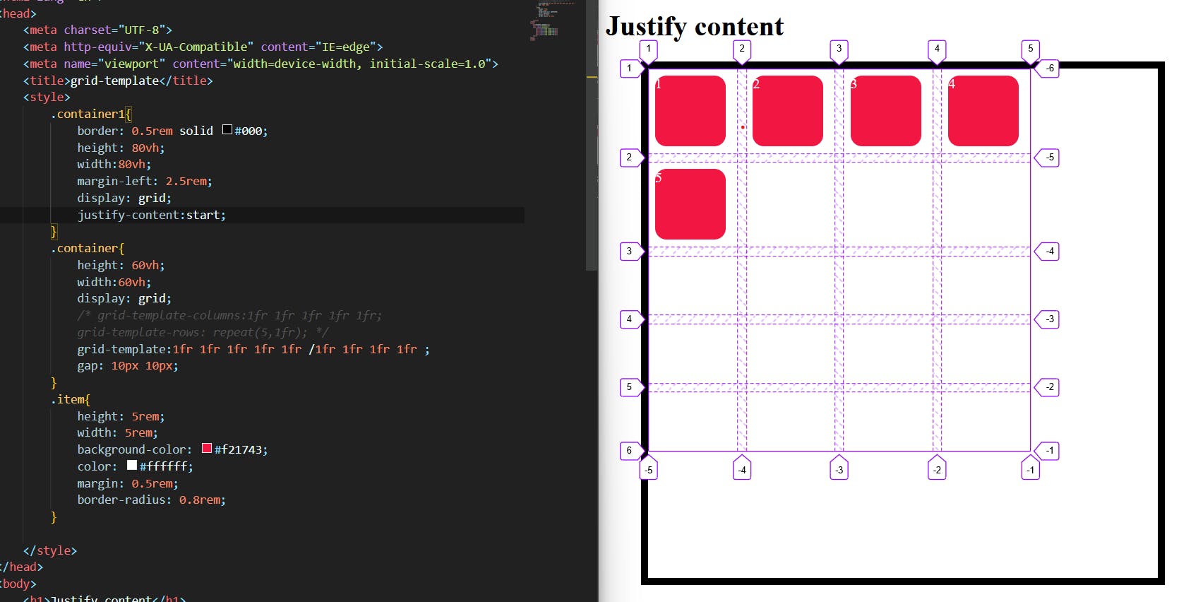
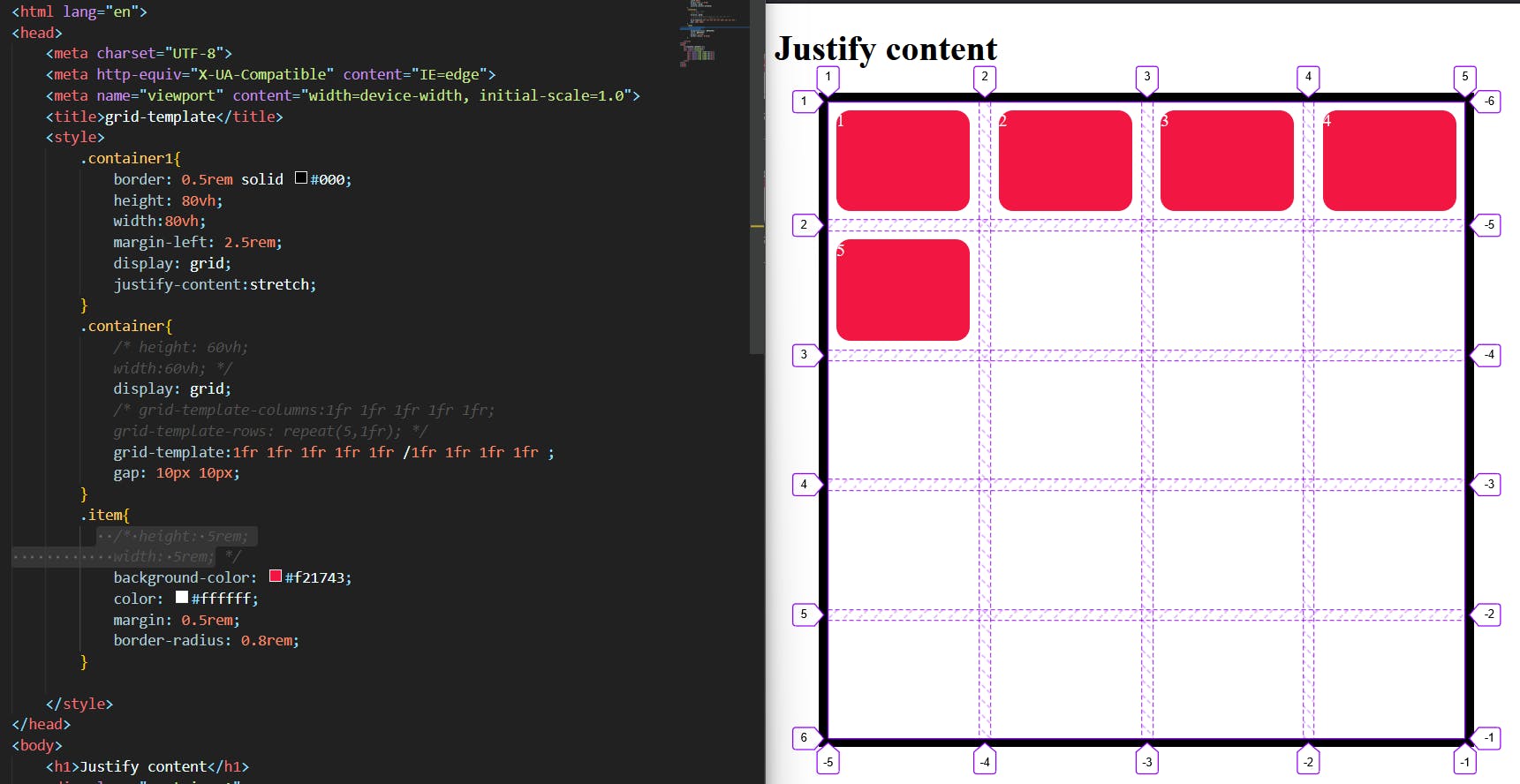
justify-content:
Sometimes the total size of your grid might be less than the size of its grid container. This could happen if all of your grid items are sized with non-flexible units like px. In this case you can set the alignment of the grid within the grid container. This property aligns the grid along the inline (row) axis (as opposed to align-content which aligns the grid along the block (column) axis).
here are some examples:
justify-content: start;
justify-content: end;
justify-content: center;
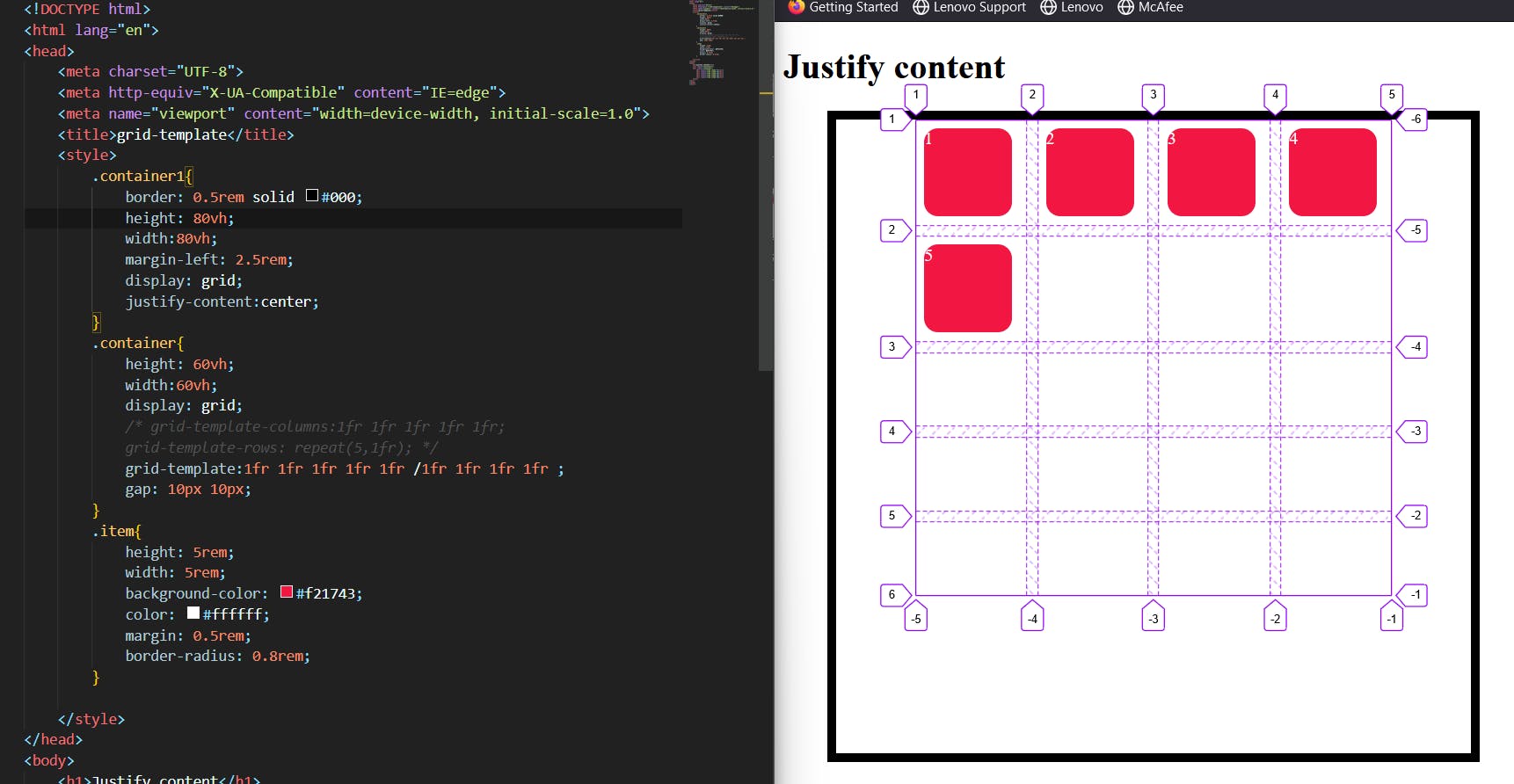
justify-content: stretch;
justify-content: space-between;

justify-content: space-around;

justify-content: space-evenly;

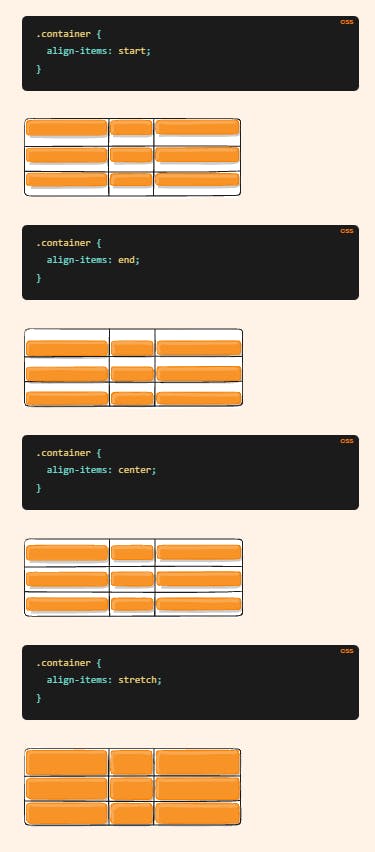
Align-items:
Aligns grid items along the block (column) axis (as opposed to justify-items which aligns along the inline (row) axis). This value applies to all grid items inside the container.
.container {
  align-items: start | end | center | stretch;
}
Examples:
align-items
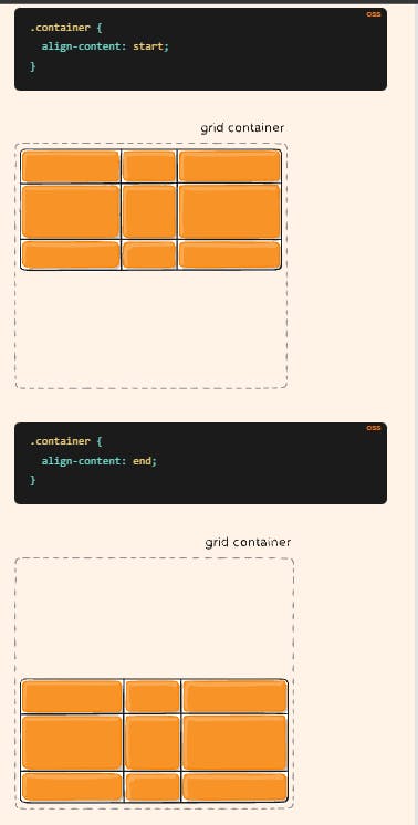
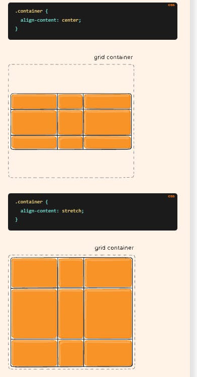
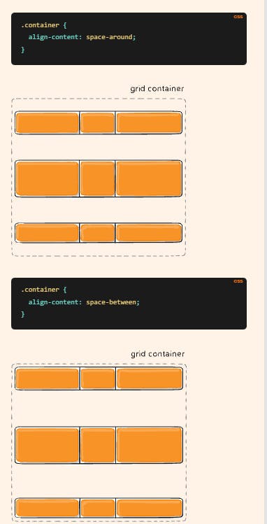
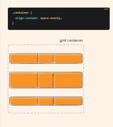
Align-content:
Sometimes the total size of your grid might be less than the size of its grid container. This could happen if all of your grid items are sized with non-flexible units like px. In this case you can set the alignment of the grid within the grid container. This property aligns the grid along the block (column) axis (as opposed to justify-content which aligns the grid along the inline (row) axis).
here are some examples
Place-items / place-content:
Place-items sets both the align-items and justify-items properties in a single declaration.
Place-content sets both the align-content and justify-content properties in a single declaration.
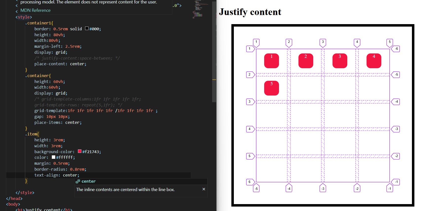
In the above image, we have two containers namely container1, the container,
we used place-items:center property to a container then we applied the place-content:center to the container1 and gave each Center value.
Grid-auto-rows:
it Specifies the size of any auto-generated grid tracks (aka implicit grid tracks). Implicit tracks get created when there are more grid items than cells in the grid or when a grid item is placed outside of the explicit grid.
with:
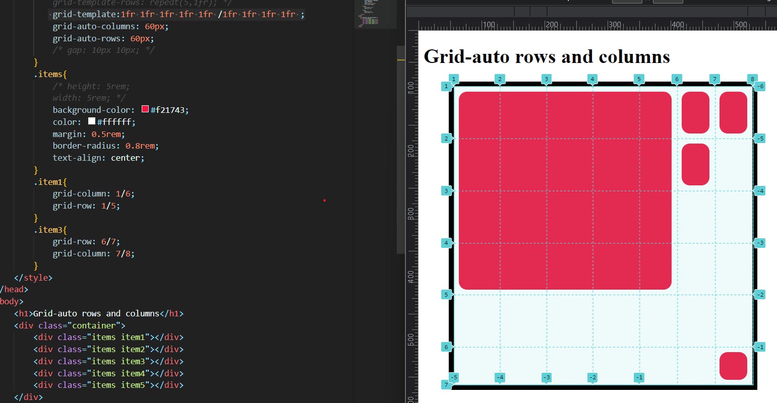
in this image, I created the grid template for 5rows and four columns but I increased the item1 by using the grid-row and grid-column and then I placed the item3 at the implicit grid so that the implicit grid track was created in order to create an equal dimension I used grid-auto-rows and grid-auto-columns and given the values of 60px each.
without :
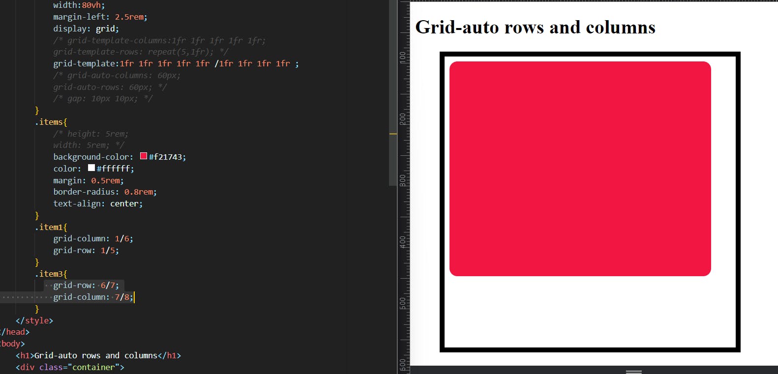
without grid-auto-rows and columns, the grid structure collapsed and the value was considered as 0.
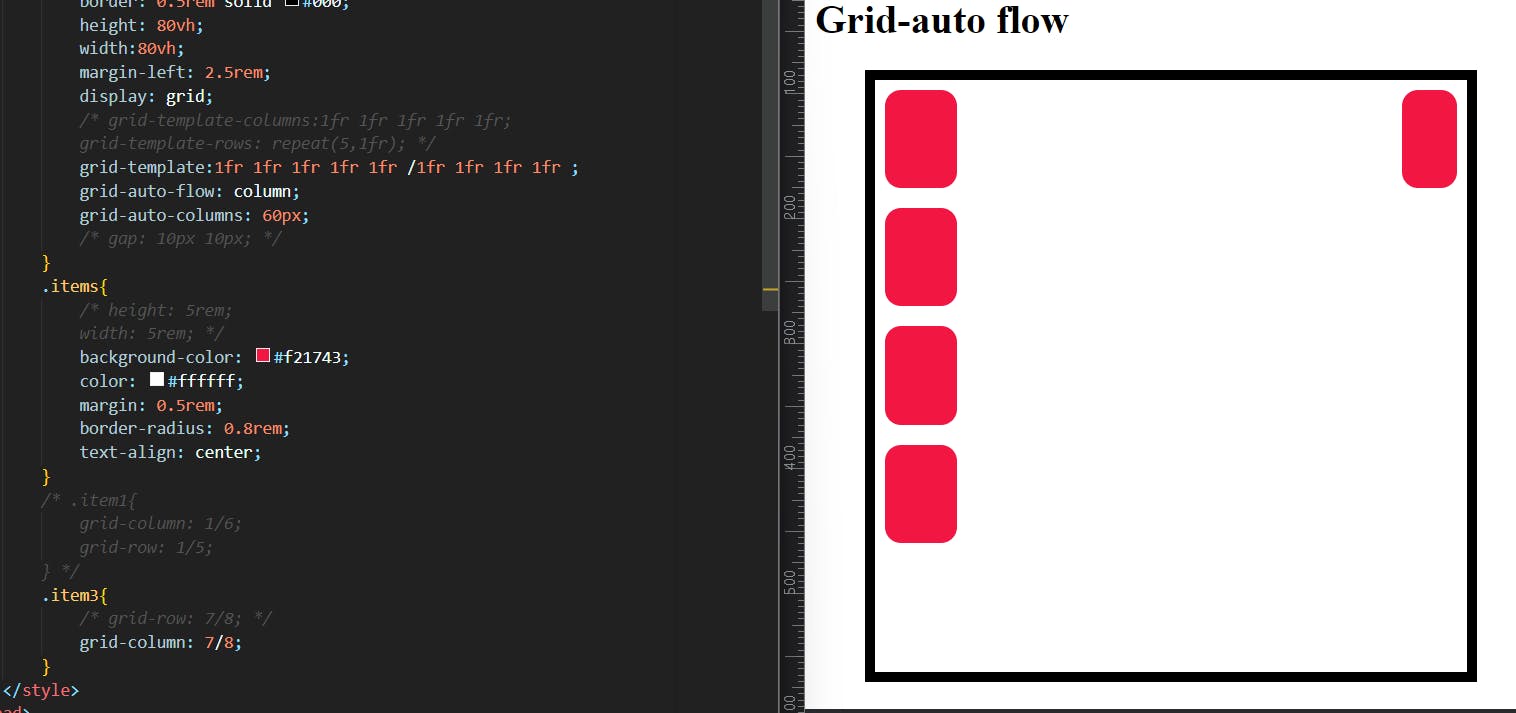
9. Grid-auto-flow:
If you have grid items that you don’t explicitly place on the grid, the auto-placement algorithm kicks in to automatically place the items in rows by default. This property controls how the auto-placement algorithm works.
values:
.container {
  grid-auto-flow: row | column | row dense | column dense;
}
row– tells the auto-placement algorithm to fill in each row in turn, adding new rows as necessary (default)column– tells the auto-placement algorithm to fill in each column in turn, adding new columns as necessarydense– tells the auto-placement algorithm to attempt to fill in holes earlier in the grid if smaller items come up later
*Note that dense only changes the visual order of your items and might cause them to appear out of order, which is bad for accessibility.
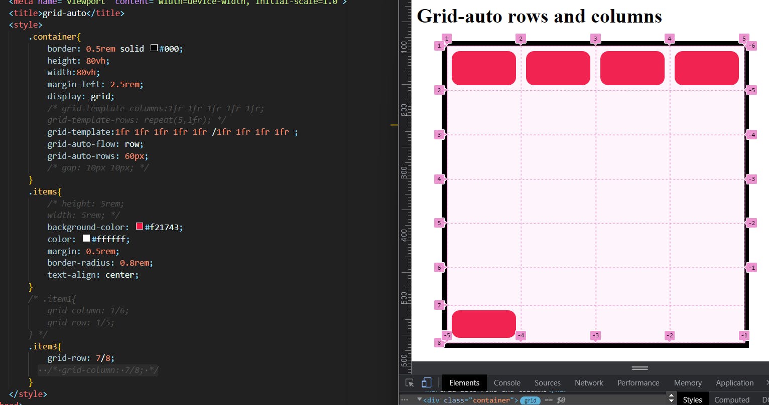
when we give auto-flow to rows it extends the number of explicit tracks toward rows to place items I tried to place the item in implicit columns but it didn't work. and it works only the grid-auto-rows property is active.
Grid:
Shorthand for setting all of the following properties in a single declaration: grid-template-rows, grid-template-columns, grid-template-areas, grid-auto-rows, grid-auto-columns, and grid-auto-flow (Note: You can only specify the explicit or the implicit grid properties in a single grid declaration). it simplifies the complex code to write in a single line.
we simply use grid:row properties/column properties; LHS we use row properties and RHS column properties these are separated by using / .
examples:
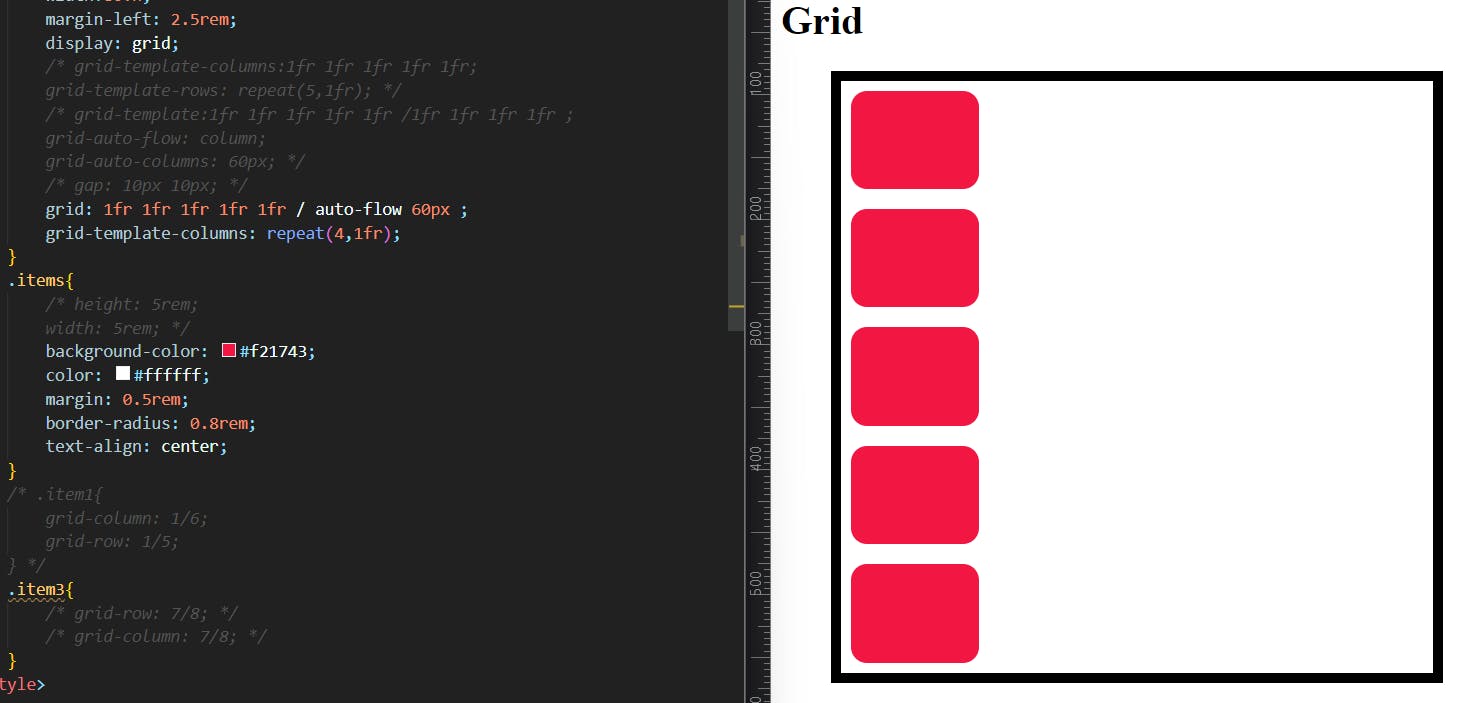
As we see in the above image I wrote the syntax of Grid shorthand I created 5 rows and on the column side I gave auto-flow with grid-auto-column value of 60px
there is only two values to be given in the Grid syntax, that's why I gave grid-template-columns separately.
Item PROPERTIES:
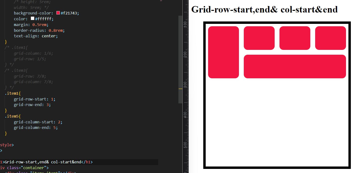
Grid-column-start , end & grid-row-start , end:
These specify the start and end values we can set for an item inside a grid.
This is useful when we want to align items accordingly.
we configure it as below:
if we want an item to expand from line 1 to line 4 in a row and line1 to line3 in a column we can write:
.item {
  grid-row-start: 1;
  grid-row-end: 4;
}
.item{
grid-column-start:1;
grid-column-end:3;
}
Grid-column/grid-row:
Shorthand for grid-column-start + grid-column-end, and grid-row-start + grid-row-end, respectively.
Values:
<start-line>/<end-line>– each one accepts all the same values as the longhand version, including span
.item {
  grid-column: <start-line> / <end-line> | <start-line> / span <value>;
  grid-row: <start-line> / <end-line> | <start-line> / span <value>;
}
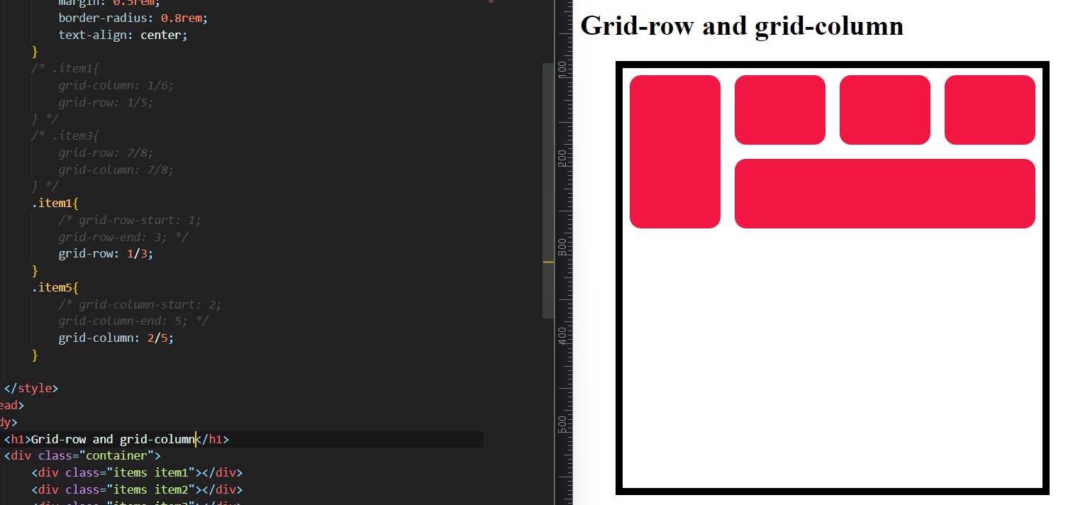
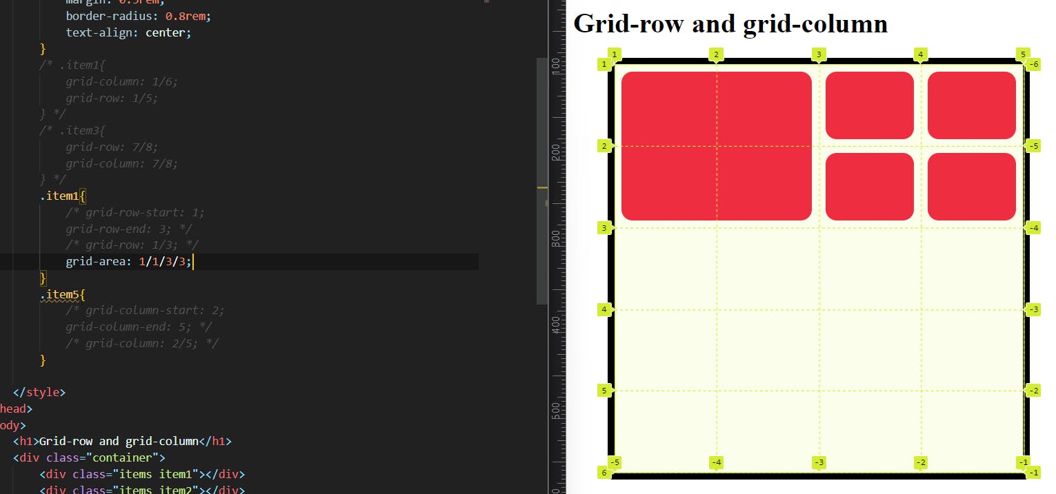
I just changed the syntax grid-row-start:1; and grid-row-end:3; into a simple form using grid-row:1/3; shorthand.
Grid area:
Gives an item a name so that it can be referenced by a template created with the grid-template-areas property. Alternatively, this property can be used as an even shorter shorthand for grid-row-start + grid-column-start + grid-row-end + grid-column-end.
Values:
<name>– a name of your choosing<row-start>/<column-start>/<row-end>/<column-end>– can be numbers or named lines
.item {
  grid-area: <name> | <row-start> / <column-start> / <row-end> / <column-end>;
}
justify-self:
Aligns a grid item inside a cell along the inline (row) axis (as opposed to align-self which aligns along the block (column) axis). This value applies to a grid item inside a single cell.
.item {
  justify-self: start | end | center | stretch;
}
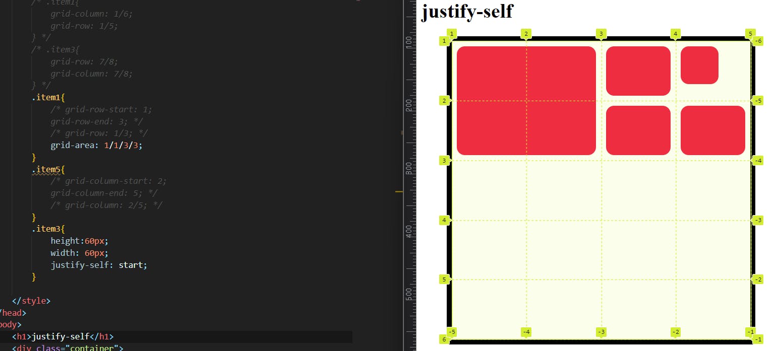
the above image shows that item 3 has given a height of 60px and width of 60px. it is lesser than the grid cell size so we can easily track the difference.
I used the justify-self property to item 3 then the item itself aligned start of the grid cell where the item belongs it will align only in the main axis (row).
we can also use other values like justify-self:end/center/stretch; .
Align-self:
Aligns a grid item inside a cell along the block (column) axis (as opposed to justify-self which aligns along the inline (row) axis). This value applies to the content inside a single grid item.
.item {
  align-self: start | end | center | stretch;
}
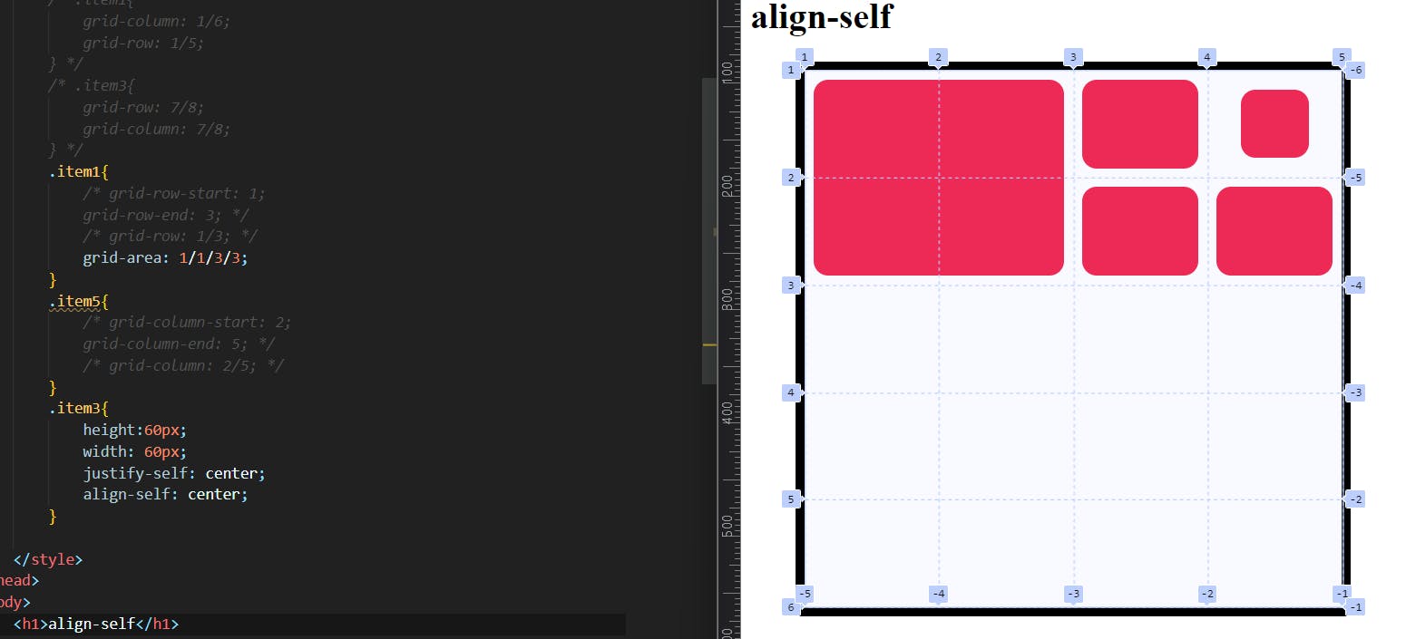
I think it will not need an explanation I guess?
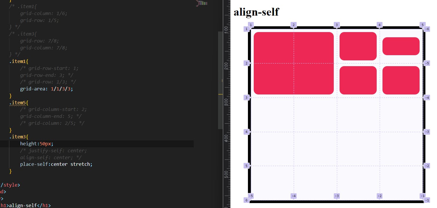
place-self:
place-self sets both the align-self and justify-self properties in a single declaration.
.item-a {
  place-self: center stretch;
}
Sizing keywords/ functions:
When sizing rows and columns, you can use all the lengths you are used to, like px, rem, %, etc, but you also have keywords:
min-content: the minimum size of the content. Imagine a line of text like “E pluribus unum”, the min-content is likely the width of the word “unum”.max-content: the maximum size of the content. Imagine the sentence above, themax-contentis the length of the whole sentence: this keyword is a lot likefrunits, except that they “lose” the fight in sizing againstfrunits when allocating the remaining space.fit-content: use the space available, but never less than min-content and never more thanmax-content.
Sizing Function: minmax():
We use the min-max () function so that we can have a min-width for our rows/columns and a max width as well.
parameters are as minimum value/maximum value;
it can be applied to both: grid-template-columns and grid-template-rows.
grid-template-columns: minmax(100px, 1fr) 3fr;
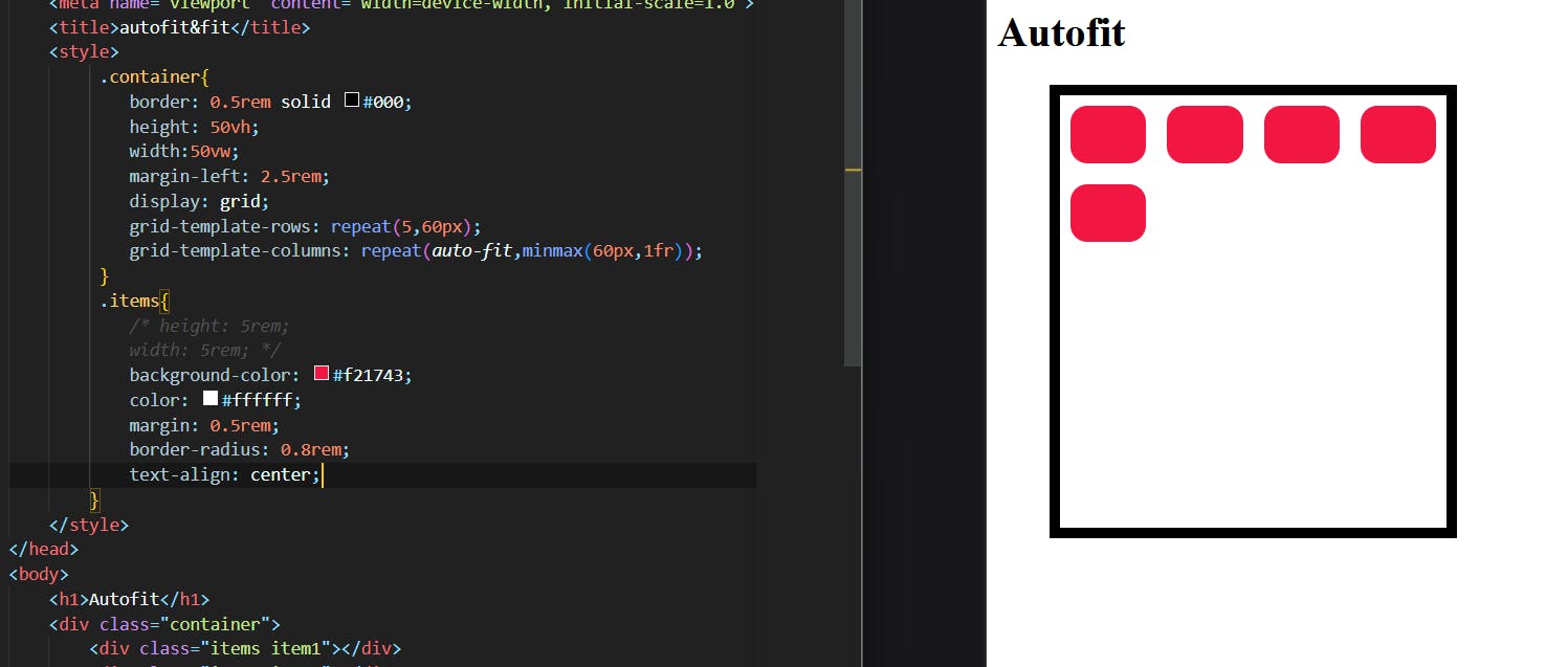
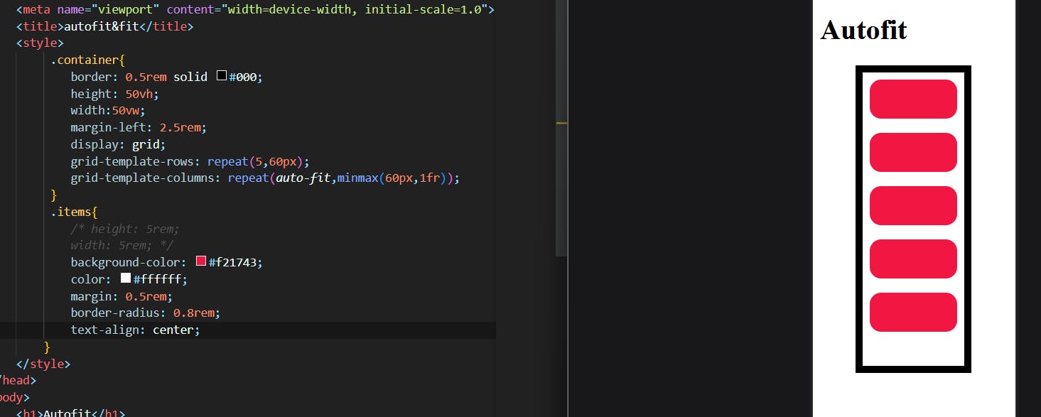
Autofill vs Autofit:
Auto-fill FILLS the row with as many columns as it can fit. So it creates implicit columns whenever a new column can fit because it’s trying to FILL the row with as many columns as it can. The newly added columns can and may be empty, but they will still occupy a designated space in the row.
auto-fit FITS the CURRENTLY AVAILABLE columns into the space by expanding them so that they take up any available space. The browser does that after FILLING that extra space with extra columns (as with auto-fill ) and then collapsing the empty ones.
There are many other things that I never dive so please consider this as a basic one.
if you want to deep dive this article will help you with CSS tricks.