

CSS Media queries are a way to target browsers by specific characteristics, features, and user preferences, then apply styles or run other code based on those things. Perhaps the most common media queries in the world are those that target particular viewport ranges and apply custom styles, which birthed the whole idea of responsive design.
There are lots of other things we can target besides viewport width. That might be screen resolution, device orientation, operating system preference, or even more, among many things we can query and use to style content.
Anatomy of a Media Query
Now that we’ve seen several examples of where media queries can be used, let’s pick them apart and see what they’re actually doing.

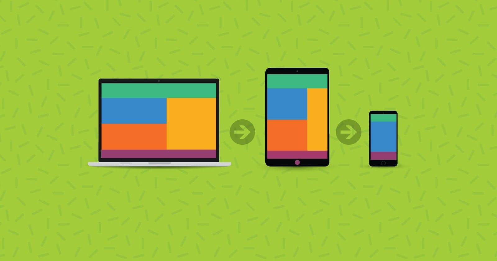
There are several types of devices available in the market. they have their unique set of dimensions. however, we don't need to mention all device breakpoints in our CSS file. there are some breakpoints that will suit almost all devices.
320px — 480px: Mobile devices
481px — 768px: iPads, Tablets
769px — 1024px: Small screens, laptops
1025px — 1200px: Desktops, large screens
1201px and more — Extra large screens, TV
this is an example of how to write the code by using these breakpoints
 @media (min-width:769px) and (max-width:1024px) {
            body{
                background-color: #253692;
                color:#ffffff;
            }
            h1{
                text-align: center;
            }
        }
We can also use the shorthand
Media Queries Level 4 specifies a new and simpler syntax using less then (<), greater than (>) and equals (=) operators. So, that last example can be converted to the new syntax, like so:
@media (35em<= width <= 80em){
            body{
                background-color: #253692;
                color:#ffffff;
            }
            h1{
                text-align: center;
            }
        }
Here is an example of how @media works
in the above example, I set the breakpoint of the viewport to screen and max width of 600px then changed the Background color to black and the text color to green whenever the viewport is in the range of 600px the background will vary according to the given values.
then I set the @media (35em<= width <= 80em) whenever the viewport width reaches the min-width of 35em the viewport changes its background color and other values that are given.
This is a small syntax for dark and light mode by using of prefer-color-scheme property
body {
  --bg-color: white;
  --text-color: black;

  background-color: var(--bg-color);
  color: var(--text-color);
}

@media screen and (prefers-color-scheme: dark) {
  body {
    --bg-color: black;
    --text-color: white;
  }
}
it will change the viewport BG color and text color .
That's it for this article hope this is useful I know that I skipped a lot of topics but for those who want to DEEP DIVE this topic I can refer to this amazing article by CSS tricks to you CSS tricks